GoedWare Game Jam #7 Devlog

Hello There!
General Kenobi?!
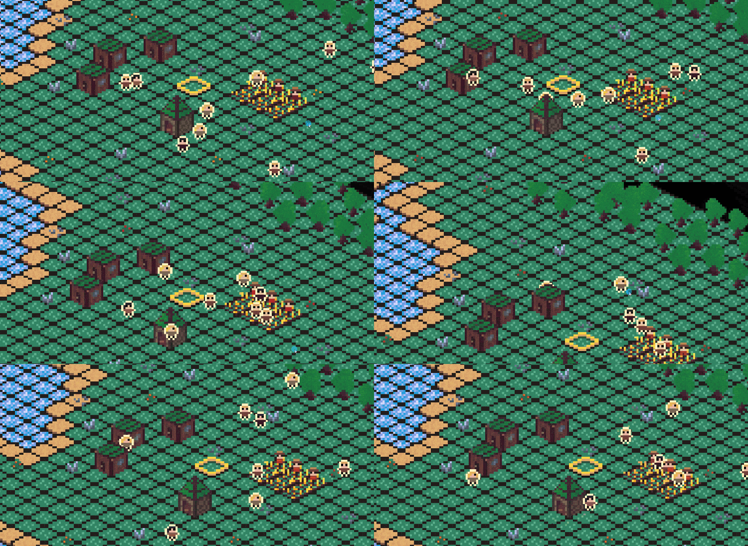
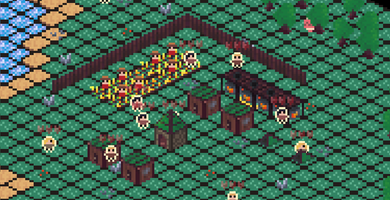
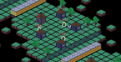
So, as is customary with GoedWare jams, this is the devlog to go along side the game: Time is Money. Money is Power. This jam was a blast to take part in, and although the game didn't turn out absolutely perfect, I have learnt a ton from it and more importantly, it's fun enough, and I had a blast making it along the way!
In this document I'm going to go over everything that happened within the jam to the best that I can recall, it was a chaotic ride so lets hope I can cover it all correctly!
To those of you who are reading this and also took part in GoedWare Jam #7, it was a blast working together with you all and chatting to you all in discord. Awesome to see the Jam get it's record number of entries for the 2nd one I was able to take part in, and I'll definitely be taking part in more in the future, can't wait to work along side you all again!

So, the plan was simple. I was going to make a small FPS game with rewind mechanics to do with reloading, and work with an alternate universe theme somewhere along the way. It wouldn't be the first time I've done this of course, I have previously worked on a similar style 2D game called "bullets come back" with a similar concept of rewinding time to reload your weapon. In that game your bullets physically came back, but I had the plan of enemies coming back to life when you rewind to reload that would make for what I believed to be interesting game design.
But obviously the game I ended up creating was not a first person shooter in the slightest. There were multiple reasons for this, but primarily it was because I simply didn't have time to deal with the weirdness of working on an FPS game. I'm a huge fan of multiplayer FPS games, COD and Valorant are currently my big ones. This means that I am very partial to the genre and have been known to go off on rants about good and bad game design when it comes to these games in the past! This means that I want to make my FPS game right, and that just wasn't going to be possible in the time of the jam. The first thing that showed me this was trying to plan the gameplay, it was going to be extremely complicated or pretty much none existant, and neither seemed optimal for a game jam. The second and final thing that destroyed this plan was working with player models. God damn player models.
How indie studios rig up FPS players will, at this rate, forever be a mystery to me. Not only was I working within Godot for the first time in 3D, but I also had no idea how to set up FPS arms. After tons of research I finally settled on using mixamo full body 3D rigs and trying to use inverse kinematics to move the arms into position for the player animation. By this time it had already taken me several hours just to get an idle animation in, and the IK was just not working. Eventually I decided just to throw it all out the window and start over. It was obvious in the time span I had, and working within a new engine, that honestly (no offence to Godot fans, I hope Godot 4.0 will be much better!) is just not suited for complex 3D games in it's currently state, this game plan was just not going to work out.
So, after much contemplating and thinking of game ideas inside the shower I decided on a game I would like to remake for myself: CIV 6. Sid Meier's civilisation series has been one of my favourites since I was a kid playing Civisilation Revolution II on the xbox 360, and I've always been interested in taking on my own attempt at making such a game (hell, at the age of 9 I tried to do it on scratch!). I then thought it could fit into the theme "Time is Power" well as well, as we all know the saying time is money and of course, in a game like civ, money is power. So hence the game "Time is Money. Money is Power" was born.
To fit the theme "Alternate history" I also originally planned on using portals that you could construct for a large amount of gold. This would teleport you to a new alternate reality that you could start a new civilisation in, effectively doubling your time allowing you to go between them and them all contribution to your money recourse. This would have the disadvantage however that it would leave you with one more civilisation to protect, and there would be waves of enemies attacking your civilisation, that would hop through dimensions via the portals if your civilisation was overrun, and attack one of your civilisations from the inside if not kept under controller.
As anyone who played the game knows, this is not how everything turned out in the end. Unfortunately due to the limitations of a game jam (ie Time!) I was unable to implement this and move onto a new, less optimal, gameplay system, of fighting pre placed enemies at the end that had "come from an alternate history". This take on the theme was flimsy and cheap at best, and straight up stupid at worst, but at least it was there, which is more than could be said from any of the previous attempts.
Aseprite
-----------
The art of the game was something I have been very solid on from the start of it's development. For a while now I have been very interested in working on an isometric game, and with the new game plan of a CIV style game it seemed like the perfect genre for making the game in.
I started off by making the basic tiles inside of aseprite, using my favourite palette that I always seem to end up turning to: "AAP-64"... The colours are just so nice.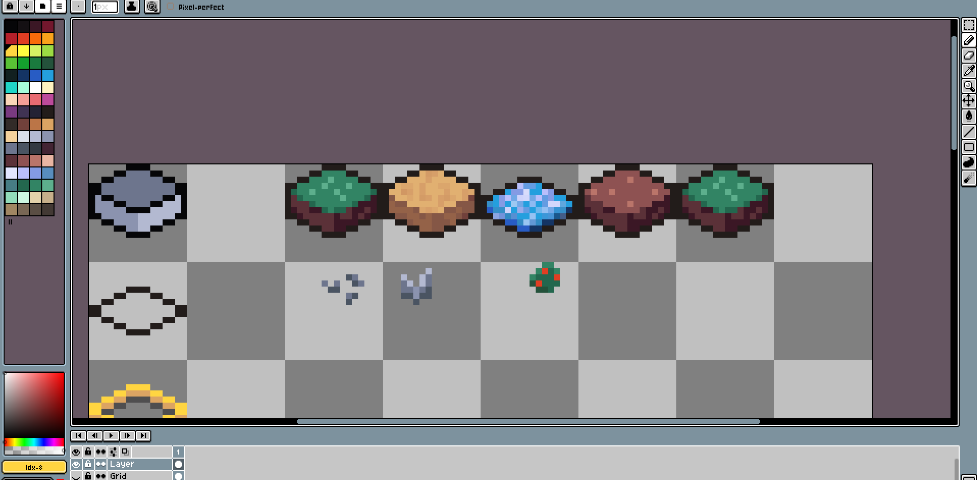
Isometric tiles themselves are actually relatively easy to work with. You begin by basically drawing 2 lines at 30 degree angles diverging from the top, and 2 at the bottom in the opposing direction to get your angle correct, then join these up and you get an isometric tileable cube! Of course it's not that simple in pixel art (because nothing ever is!) and you actually work at a 27.33 degree angle (or round about) or in other words 2 across + 1 down. 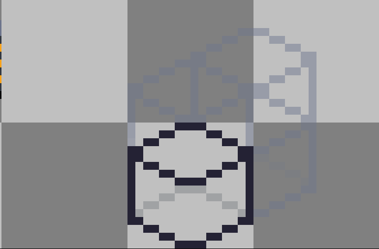
If you have done everything correctly you should end up with a cube like the one above. This can then be used to extrapolate to further cubes that can be tiles and messed around with. The above image is actually a picture of the grid I used for more complex objects in a lower-opacity layer behind while I was drawing, since aseprite doesn't natively support isometric grids.
As you may have noticed I chose to use half-height tiles for the floor. The honest reason for this choice was, I thought it looked call! I loved the cutesy look of the really thin 8x8 tile that don't contain much detail and I wanted to replicate that within this jam. By going for 8x8 tiles (8x16 in cartesian coordinates!) I also limited the amount of work I had to do visually. And my strength within pixel has always been working with really low resolutions so I was more than fine with that. During this process I also made use of many references, especially these two asset packs also found on itch.io which acted as huge inspirations for my tiles! Looking at them now it might have actually been smart to use the assets that people had already made, but making the art myself was almost half the fun!
https://gvituri.itch.io/isometric-trpg // https://nulldreams.itch.io/pixel-isometric-tiles
Apart from that I also proceeded to make all of the building assets and vegitation and stuff inside of the same aesprite tileset file.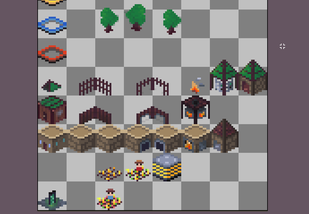
An interesting tid-bit for those that noticed as well: The enemy buildings are simply the normal buildings hue-shifted within paint.net to make them slightly separate and fit the theme of the mutated humans!
Affinity Designer
---------------------
On top of all this game development, I also managed to develop an affinity designer addiction just before the jam! For those who haven't heard of the software, affinity designer is very similar to Adobe Illustrator or Inkscape. Personally I hadn't had much success using Inkscape, and Adobe's pricing is just ridiculous these days (even with the student discount that I could have access to!).
However, I was interested in making a new GoldenDonkey logo to replace my previous logo (made in Paint.net) and after some research I picked up the Affinity Designer free trial, and as you might be able to tell, I'm absolutely going to shell out the £35 for the full version when my trial ends!
I actually got distracted making lots of different things pretty unrelated to the game, but it took up a large part of my time so I wanted to at least mention this in my devlog. Some of the things I worked on specifically were new logos for both GoldenDonkey and my freelance site (tobycsmith.com) along with icons for the game itself and all the banners and artwork you see across my itch.io profile, this game page, and even the titles on this very devlog!
Even this example banner was made in Affinity Designer... Please send help!

Right then, onto Godot!
Let me preface this, I have for over 8 years now been a Unity developer. If you take a quick look at my profile you'll notice most, if not all, of the games are built on Unity. I could rant for days for the reasons I've been choosing to move away from Unity for my personal projects in recent years but they can be mushed down into 4 main reasons for me:
- I don't like the move to more package based items that started after Unity 2020. Packages are a pain in the arse to work with, and worse it gives Unity even more options to EOL something without replacing it (we didn't have official networking for like 5 years damn it!)
- The company has made some very controversial moves in recent times that I personally don't agree with. Just look at r/gamedev a few months ago for examples of this, every week there was a new controversial move from Unity
- I work freelance and most of my work is done with-in Unity, it's nice to differentiate occasionally.
- I love learning new tools. That's one of the things that got me really into game dev was picking up new tools to mess around with and learn new things in. A game jam can be a fantastic opportunity for that.
For those reasons I have chose to work with Godot for this jam. I've been using Godot on and off for over a year now, so I've got a pretty decent idea of how it works... The engine itself is actually quite different from others I've used like Unity, sepcifically they use an OOP approach to the engine instead of ECS which is something I'm more used to. I'm not sure if I like this yet, I think both methods have their place. Godot's scene system can be used fantastically for organising massive node trees so it's not really an issue, and if, like me, you're stuck in the ECS mindset, you can effectively use nodes to create entity-component relationships where necessary for your game!
Not to mention GDScript is a god send for game jams. I'm a huge C# fan, and even I wont touch it when there's the opportunity to use GDScript. For those who don't know, it's a python based language with a few syntactical similarities to languages like Lua. It's extremely easy to prototype and work in, and because it's specifically designed for the Godot engine, something that could take me 15 lines in Unity and C# may only take me 3 within Godot. I'm not a fan of the node searching mess of variables that needs to be done at the top of every script, even with the new "%" access node modifier that's accessible, it's still not a fantastic system, but overall with a bit more practice Godot could quickly become my preferred engine, and that's part in thanks to the power of GDScript!
Godot also has a fantastic input management system, great user file system organisation, nice default interface and great support from other game development tools. But one thing it doesn't have, is a decent bloody UI system. Godot's UI system was the bane of my existence for this jam, to the point where I literally took time out the jam to create a meme to post in the discord server to show my frustration.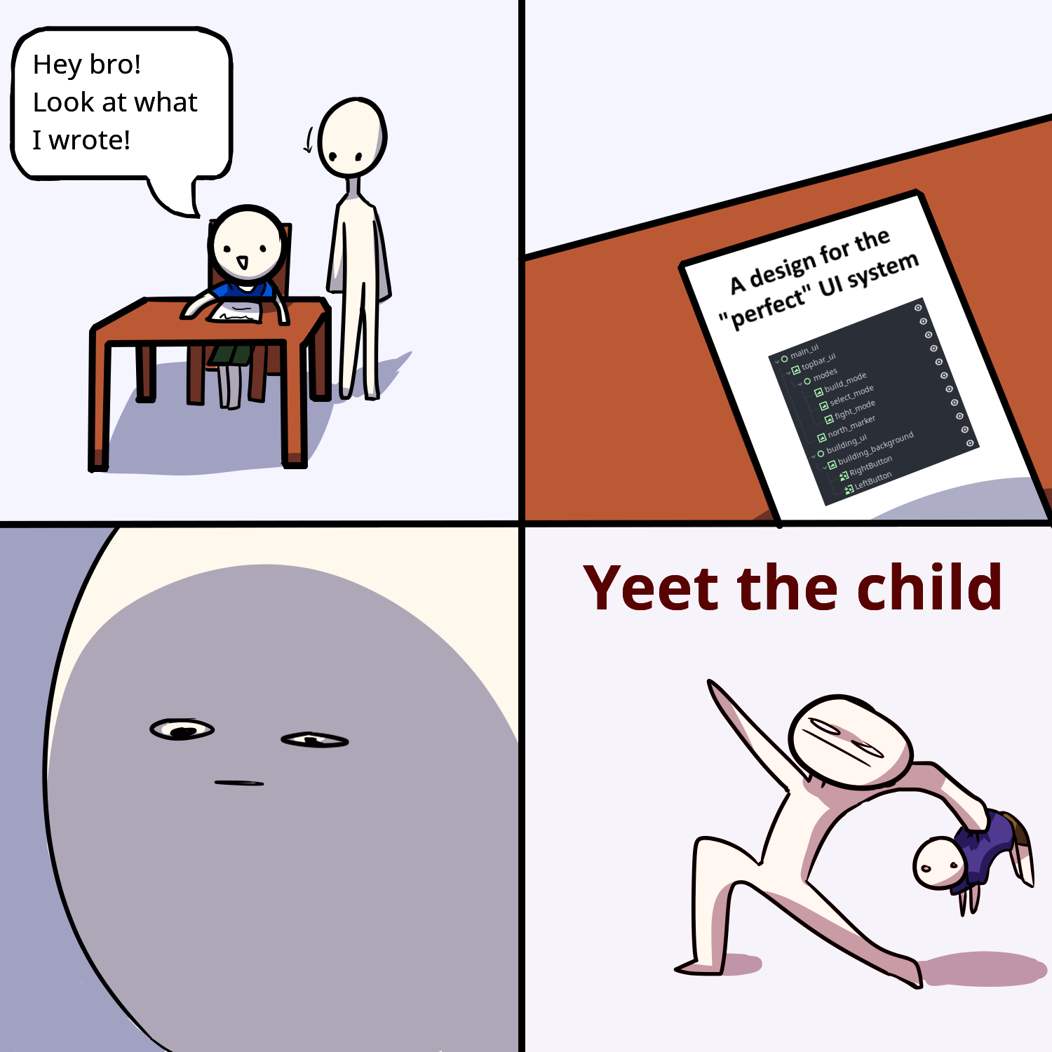
Now, there is never such a thing as a perfect UI system. Unity's is hot garbage and often causes scaling issues, even for people with years of experience and messing with it's stupid settings like myself (Unity's default settings are seriously ridiculous, but that's a different matter!). Even web development, the UI design is a huge pain. 50 different ways to centre a div in CSS and none of them are as seamless as "vertical-center: true" like it basically is for horizontal centre... Like how in the year of 2023 is that possible?! But all of that pales in comparison to Godot's UI system.
This system was made purely to infuriate whoever is using it. Not a single person I read online seems to actually know what's going on, and the system makes a total of 0 sense. You not only have a mix of anchors and containers and scale-flags that all work against each other, when you modify a setting in the editor, it doesn't mention half the time if it will be replaced by something else! So you'll move your button to the bottom left corner, then go and do something else, and 10 minutes later you'll notice your button has move back to where it was! Like why is this a thing, Godot?! Admittedly towards the end of the project I was starting to get a hang of things I believe, but I think that's partly to me having spent years just adding containers and changing size-flags until stuff worked and then just copy and pasting this to make other stuff.
So the lesson here is simple. If you want to make a game in Godot that is UI heavy: steal someone else's node tree and just use that and modify it to your needs. Starting from scratch is an absolute nightmare, but if you've got someone else's work you can blame it on them rather than yourself when nothing works as intended.
I will say that the screen scaling is very nice though, handled much nicer than basically any other game engine I've come across.

I think everyone reading this will know what crunch time in a game jam is, but if you don't, it is effectively the bit right at the end of the jam where you realise you have only got half of what you need implemented and you start rushing around trying to get everything done in time while spiralling in an exponential cycle of realising that features you wanted were never going to get put into the game that you will need to redesign the game entirely for the worse just to get it finished. *And breath*
For this jam that was no exception. I have already covered much of what I wanted to say above in the planning section. But here I want to go over some of the more specific features that were unfortunately cut from the game just for not working out and having severely out scoped myself as I do every time!
To start this off, I want to mention I never planned on having a control system so complex in the final project. My plan was to use the WSAD movement system for prototyping and replace it with a mouse cursor based system, more similar to the inspiration of CIV, further down the line towards the end of the jam. This did not happen, and the reason is actually quite simple. Converting between cartesian and isometric coordinates can sometimes be a nightmare. Sometimes it works no problem at all, and other times it just straight up doesn't work one bit and there seems to be no rhyme or reason. Unfortunately getting the mouse's world position in isometric coordinates turned out to be one of those weird times it just didn't work. And rather than worrying about it and getting further confused, I decided to move onto the confusing mess of a system we have now. The same can actually be said for why the camera doesn't move when the cursor goes off screen as well, it was simply because the coordinates between screen -> world -> isometric were just not converting well and I didn't have the time to solve the problems.
Another thing is the selection system itself. The way it works is it selects objects that are placed directly on the tile they are supposed to be, not objects within the cursor as the visuals might suggest. This works fantastically for runtime placed objects that will always be in the correct position, but for objects like the mutated human villages, well, the bug that doesn't let you attack the final town-hall is all you need to know! This is purely down to the town-hall being 1 pixel too far too the left in the jam version of the game, and results in the game being incompletable due to this tiny issue. This is also one of those things that I planned on implementing a better system for but never got around to. The design would have worked well for the original plan of the game, but unfortunately it didn't work out as intended for the final project and has made the game unbeatable... You live and you learn I guess!
The final big thing that got struck off by crunch time was the settings menu. I put in settings in nearly every one of my jam games, it's a point of pride at this point, and I often find a jam game with a settings menu (and pause menu) shows just that little bit better User Experience that improves the game heavily in my eyes. Unfortunately as you can see in the menu, the button is disabled and there's no settings menu. I probably would have been able to do it if I was working in Unity, but unfortunately there just wasn't enough time for me to do it in Godot reliably and I didn't want to break anything by rushing it!
For this jam I probably crunched for about 3 days straight, from Friday to Sunday. I spent lots of time during that time doing other stuff, but every second I had was focussed on making the game. The first day of the jam was unfortunately wasted by my FPS attempt and the 3 in between I was distracted by university and just overall procrastination. Had I used that little bit of time in between a little bit better I think the UX of the game could have been significantly better over all, which I think is the major thing damaging this game right now.

Well, first of all thank you for making it through all those crazy ramblings of a mad man, who is writing this at the 4th 2:30am he's seen this week.
Overall this jam has been a blast, and I am rather happy with how this game has turned out. It's certainly not my best work, but it's certainly not something I will ever be ashamed of either. I think the game had a really strong concept originally, and the art style definitely worked heavily in it's favour. The gameplay itself is actually relatively fun and satisfying, and most importantly re-playable which is something I've tried to strive for more in my recent games. I'm definitely very glad I didn't go with the original FPS idea considering some of the other entries to the jam that blow what I could have done out the water!
Will I try to finish it in the future? Maybe, I'll see how the results of this jam go I think. It would probably involve restarting the project anew in Godot, rewriting a lot of the code and improving it, currently it's an uncommented hell-scape that would give anyone a headache, including future me when I end up looking at it again!
I think without the restrictions of time and themes that comes with a game jam, the game would be better suited to a genre more like survival, maybe a survival city builder? The art could also do with being a slightly higher resolution too to allow for that bit more detail, and the controls and complexity need a complete overhaul just to make it playable by your average person. Adding more mechanics to the city itself too would be a must just, to make it not ridiculously easy to grow your city if you just think about the correct path for a second before hand.
Anyway, GoedWare Jam #7 has been a great jam, and certainly gone better than my previous entry to these jams - a weird D&D and book hybrid. It was fantastic jamming with you all and I can't wait for the next time.
Get Time is Money. Money is Power
Time is Money. Money is Power
Defeat the mutated humans from an alternate reality by building your city and sending your population into battle!
| Status | Released |
| Author | GoldenDonkeyProductions |
| Genre | Strategy |
| Tags | 2D, Alternate History, Godot, Isometric, Pixel Art, Real time strategy, Short, Singleplayer, Story Rich |
Comments
Log in with itch.io to leave a comment.
I finished writing at about 3am so not sure how info packed it is towards then end, but cheers! :D